A trend is defined as the general direction in which something is developing or changing. It is a fashion of some sort that implies improvement and innovation. It is a change in the current pattern that pushes an industry forward for the better. Trends are the result of experimentation and are the driving influences for change.
It is very ironic that the only constant thing in this world is change. Evolution is the key to survival and the same principle applies to creative fields. So, to usher in the coming New Year in just a few weeks here are the best website design trends to look out for in 2017.
Adopting a mobile-first approach
This design isn’t new to 2016 and has been around for a while but with the advent of smart phones not only at full swing but becoming the primary devise used for browsing the web more and more companies are seeing the importance of having a website that’s fitted for a smaller screen and is able to convey content effectively in a hand held device instead of just on a desktop computer.
Smartphones albeit increasing in size still possess significantly smaller screens than desktops, laptops, and tablets. This limits the amount of content a user sees when they view a certain website.
This trend gives the advantage of filtered information. With a significantly smaller display, brands really consider what they include in their pages making websites clearer, more concise, and easier to navigate.
Responsive Design
Although this isn’t something new, a wider implementation is 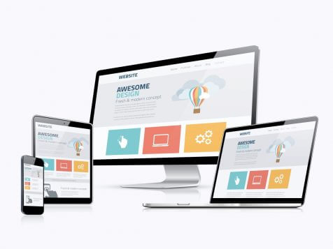 expected in the coming year. Aside from a responsive-based site going hand in hand with the mobile-first approach, this trend fosters cost-efficiency.
For those who are yet to learn about responsive based sites, these are simply websites that employ a design that caters to all or most devices. It is essentially an approach to website building using CSS media queries and flexible grids and layouts that allow for contents to be adjusted based on the device used to access them.
The principle behind the upward trend of this approach is based on functionality and accessibility. It’s as simple as trying to access a website on your mobile phone with a layout meant for a desktop computer. The task is too tedious and I for one would prefer to wait until I can access a desktop computer or just choose a different, easier to navigate website altogether.
Microinteractions
Echoing the need for a mobile-first approach, it is very important for mobile designs to improve microinteractions. Microinteractions are the interactions between bigger interactions that are simple enough but play a crucial role in user appreciation. These little things such as being able to tap an alarm to turn it off, a button changing color to indicate that it has been pressed, and a sound indicating a notification, although not readily noticeable, add up to a more enhanced user experience and shapes how users find the general accessibility of an app or site.
Original Imagery
Although stock photography is a long way from extinction, cheesy photos have begun their decline in the tastes of many. Images play a massive part in visual presentation and it is projected that customers and users will begin to seek authenticity from the brands that they patronize. The usual stock imagery just doesn’t cut it anymore and in order for your website or your brand to really make a connection with it’s viewers, carefully considered tailor-made visuals are required.
Illustrations are one way to make your website stand out. They are fun and very versatile. A good illustrator can make visual content that are personalized and unique to your brand giving it a more distinct presence in an increasingly crowded online souk.
Authentic photography can also be utilized if you wish to keep up with the originality trend.
Typography
Adding to the visual aesthetic of your website, typography is also a key factor in the upcoming year’s design trend. This trend has already begun and is increasing in popularity so expect to see vigorous text and image layering together with parallax scrolling in 2017.
Over-sized, beautiful, hand-rendered typography sets the tone and makes your audience feel the emotion that you want to convey and with unceasing improvement in device resolutions, expect this typography trend to go even further in terms of visual impact.
Videos and Animation
Using background animation can make or break your page. It may add dimension or it could end up distracting the audience. This coming year welcomes gentle background animation that will enhance your page’s content. As everything else becomes more advanced, static imagery is no longer enough to increase viewer engagement.
Another factor to consider with regards to video and animation is the story-telling factor. If a picture paints a thousand words then a video must paint tenfold. Moving images attracts viewers’ attention and allow brands to get their information across more effectively.
Rich Colors
The use of bold colors began its ascent in 2016 and is believed to  keep its place until the coming year. Although a lot of brands are still stuck on the web-safe tones, more and more have discovered the advantages of going all out. Not only does this fad with over-saturation, vibrant hues and resurgence in the use of gradients signify aesthetic transformation and increased attention grabbing qualities, it is also an indication of technological advancement in terms of monitors and devices with screens that are more apt at reproducing richer colors.
Follow this guide from uxpin.com for choosing the right color to convey a certain emotion:
- Red – conveying passion and caution, red actually increases blood circulation.
- Blue – Creates a sense of calmness and stability, which is why the color is common with financial institutions.
- Green – A nice balance between warm and cool colors, green conveys environmental friendliness and affluence.
- Purple – Historically associated with royalty, purple creates a sense of luxury and mystery.
- White – A perfect neutral color that pairs with other colors while communicating elegance.
- Black – Sophisticated and powerful, black remains a timeless color choice for most websites.
For photos and over all color schemes, uxpin.com also tells us to keep in mind the following tips:
- Use simple photos with a single, clear subject. Busy photographs, such as panoramic landscapes, may be obscured.
- Contrasting colors make it easier to distinguish what’s in the photograph.
- Set off the photo from the rest of the screen with a colorful border or scrolling slider.
- Use crisp and focused pictures, with clear divides.
Basically, the trends are summed up in terms of attractiveness and usability and can be summarized in 5 core goals:
- Sites that are well expressed in all devices
- A clean appearance that show the user the message up front
- An impression that exudes quality and trust
- The right blend of simple and attention-grabbing visual factors
- A fast loading site
There you have it, the projected trends for this coming New Year. Start your refurbishing as early as now! Remember that if you’re not ahead of the times then you’re most certainly behind it and that trends are only tools that’ll help you in your design so you must know when and how to use them.